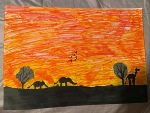
 My artwork is a silhouette with a sunset in the background. The background colors are orange, red, and yellow. There is two trees and 3 animals in the artwork. The animals are two elephants and one giraffe. There is six little birds in the sky. I sketched it out first, then I filled in the animals and landscape with black marker. After that I used red, orange, and yellow to make a sunset. I am showing that animals are the main idea when people think of africa. I have seen so many picture of the giraffes and elephants when people travel to africa. My goal for this artwork was for it to look like a african american artwork and I feel like it does.
0 Comments
   I plan to focus on the text and image postmodern principle. I think that it is the best way for me to express what i'm showing in my artwork.
For this artwork I am focusing on the text postmodern principle. I am gonna create a artwork that includes little pictures of sceneries because they make me happy. Then I am going to center my favorite quote that inspires me to bring it all together. 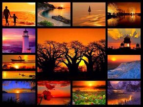 At first I wanted to create something like this but then I thought it would be unique if I turned the middle into a quote to bring the pictures together. 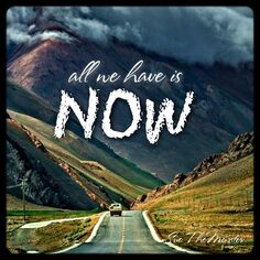 I plan to put this quote in the center of my pictures.
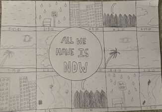 My artwork has 15 boxes with sceneries inside of them. I have centered a circle in front of all the boxes with a quote in it. I used just a pencil for my material. I used a ruler to make the boxes and I used a stencil for the circle. First I made 15 boxes evenly distributed across the paper. Then I made a circle centered between the boxes. I like to travel and in these boxes are different outside sceneries that make me happy. In the circle is a quote that brings the artwork together. I picked this quote because inspires me to do what I love as in travel and that is what my artwork is expressing. My goal for this artwork was to show what makes me happiest. I am using the text Postmodern principle because I felt that this was the best way to show what I was expressing. I think my artwork could come off bland but I like it because I like bland. I think it was successful because what im expressing is simply clear in some ways. It brings a lot of different thoughts to the table and that's what my goal was.
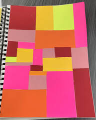 My Artwork My Artwork I feel as if this artwork was one of the less challenging artworks. It was less challenging because your not drawing and its easier materials that your using. The challenging part for me was trying to figure out the sizes of the squares and rectangles I put in there. It was also challenging to find what colors would go together well. I did learn that neon colors and matte colors don't collage the greatest and I feel as if that was my biggest mistake.  Adam Hale- Collage artist  Jesse Treece- Collage artist 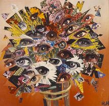 Hannah Hoch- Collage artist Adam Hale and Hannah Hoch use leftover magazines and newspapers for most of their collages. Hannah's artworks are about the social issues of her time. Jesse Treece on the other hand like to use make artworks using designs from the 60's and 70's.
I did a monoprint. I didn't know what picture to draw on my piece of styrofoam. I had so many ideas that just didn't turn out at all. It was a struggle to get clear lines so people could tell what the picture is. I created a sunflower because I'm patiently waiting for summertime to come. I think my artwork turned out a little sloppy but I think it's successful because you can tell what it is. 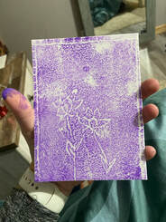 This picture is my artwork. Two studio habits of mind i learned from this project were to envision and reflect.
My artwork looks like a view from the forest. There is a dark blue sky with a bright shining full moon. There are trees that go just above the horizon line and the trees are black. There are bright colored stars in the dark blue sky to make it seem more realistic. I created my artwork using acrylic paint. I used a big brush to do the background and a small brush to do the trees and stars. I mixed yellow and white to create the moon color but then it was too light so I added a little bit of black to create a darker color. The idea behind my artwork is to show that it is somewhere I would like to be, it is somewhere I would feel calm and relaxed. The goal for my artwork was to make it look like a calming and relaxing place to be because that's the idea I want people to get from it. I think my artwork overall was good, I feel like people could understand the idea behind it. I do wish I could've went more in detail but now I know for next time. 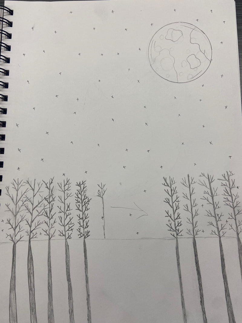 This is my first sketch of my artwork. 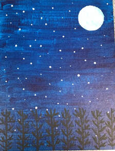 This is my final artwork.
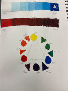 Acrylic Color Acrylic Color Color Wheel and Tints. 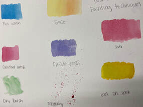 Watercolor Watercolor Watercolor Techniques.
I was inspired by a classmate using repetition. I also love playing volleyball so that is why I used a volleyball as the object. One of my thoughts well doing the artwork was how the materials would blend. I was scared they wouldn't blend well because the oil pastels smear. The oil pastels did smear into the pencil a little, it made some black marks. Overall i would say it didn't turn out like i expected but it didn't look far from what i expected. 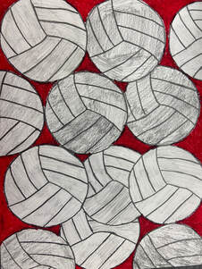 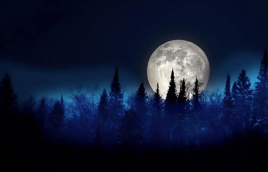 Here are two of my inspiration photos. I wanted a lot of trees but i also wanted the big moon so i took aspects from both of them. 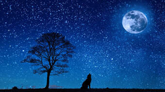 Here is my current progress, I have many ideas still to add to the final painting but this is the general idea. For my final artwork I am using acrylic paint on a canvas. 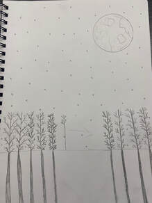 |
AuthorMy name is Kailey, im a sophomore and i love the color grey. Archives
April 2021
Categories |
 RSS Feed
